Friday 31 January 2014

Creating a Clothings Ration Book Gallery Guide


For my second piece I used the idea of the Clothing Ration book, but decided to turn it into a Gallery Guide book, showing the contents of the exhibition and information about the pieces. I chose this because I thought that the ration book was already in the form of a book and was a convenient size that would translate well into a Gallery Guide. I started by buying a replica of a clothing ration book so I had a base to work on. I first scanned it into the computer and then printed it out in black and white. This was so I could find out how big or how small it would print when I put two pages to one sheet of paper. Fortunately I found that this printed out at the right size, and I planned to continue in this size, but in colour.


After printing out all of my chosen pages in chose and cartridge paper and sticking then all together in the correct order, I discovered that the scanner I used had two black marks on it that can be seen on each of the pages printed. This, I thought made the booklet look dirty, although they needed to look old; I did not want these black marks on the paper. This meant that I had to re-scan and re-print all of my pages.
After re-scanning and re-printing, I successfully stuck together and organised my chosen pages. I decided to use the front cover pages as a place in which to put the information about the exhibition using the same 
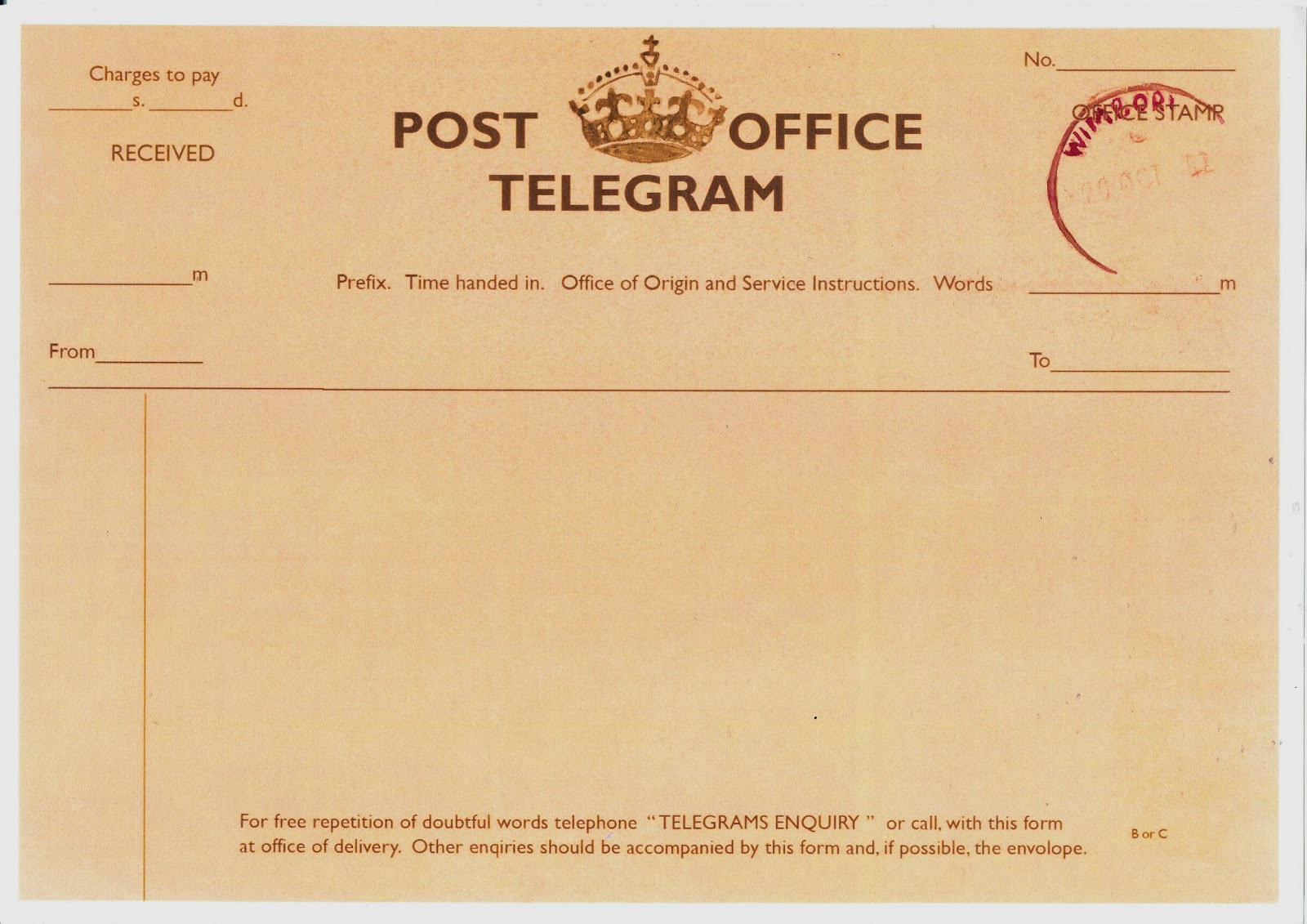
stamping technique I used in the telegram piece. I stamped the name, place, and 
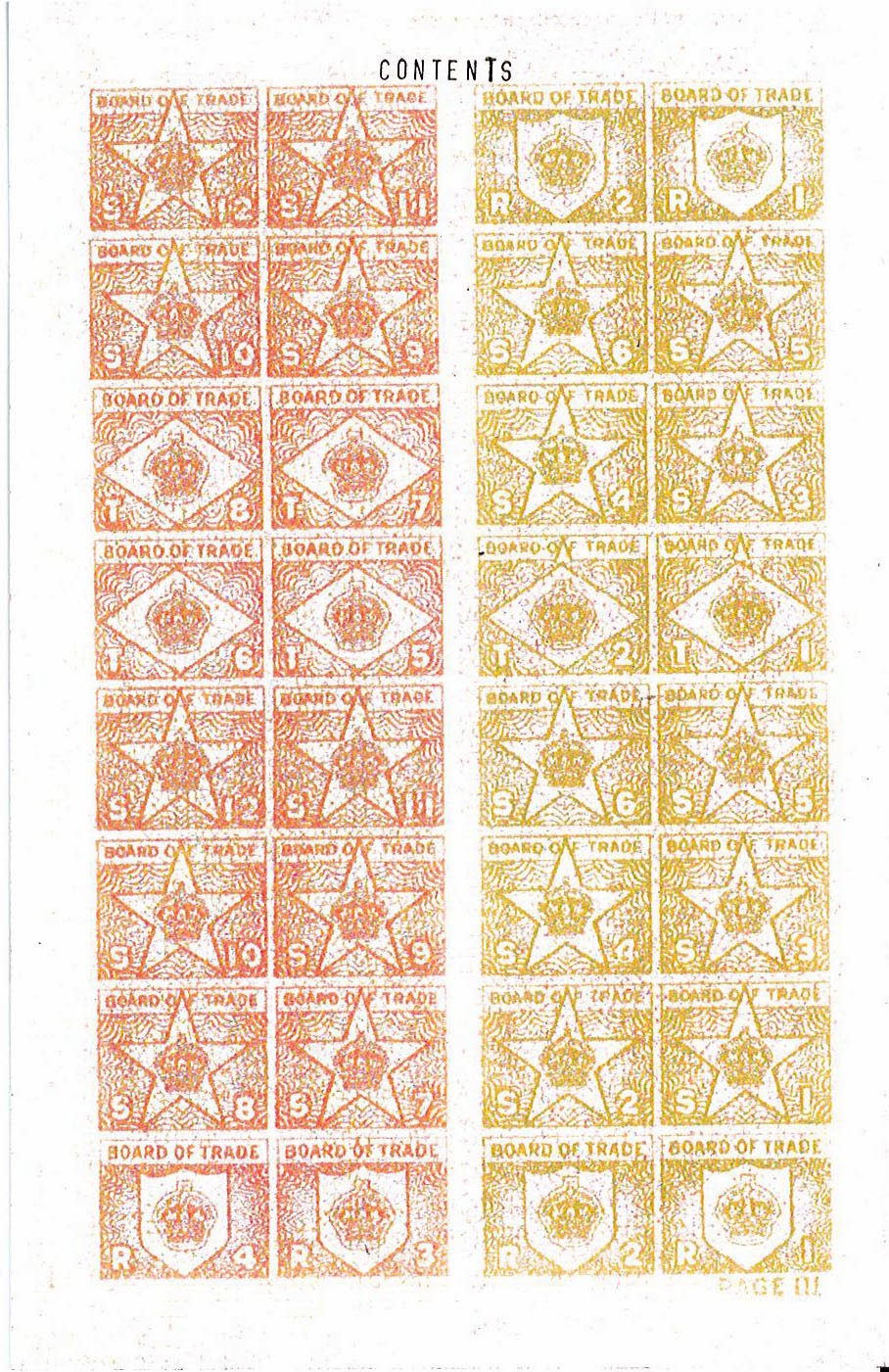
date in the corresponding boxes on the front page. I then used the first ration token page to print the word ‘Contents’ onto the top of the page, this actual contents can be printed at a later date in the same technique. For the final page with stamping on I printed the word ‘Notes’ this is so the people who use the book can make notes on their favourite pieces, or of an artist they discover.


Completing the Telegram


Still using the telegram image I used as my initial inspiration I discovered that the information was not printed directly onto the telegram paper but typed on a typewriter and then ripped and stuck down to form the message. As I did not have a typewriter, but still wanted to achieve this effect I found that I could use a stamp that was used for stamping addresses onto documents, I simply used the small letters provided to form My desired message, which was the date, place and name of the exhibition. I found that using simple phrases and short sentences worked very well, because the point of a telegram was to be short and to the point.

By using the stamps and the ripped paper, I created a poster that gave the required information while still retaining a feel of the 1940’s wartime Britain. When this was scanned some of the colours we drained from it, as it appears slightly darker in physical form.

The Process of Making a Telegram Base


I decided to use the idea of the telegram for my poster design, which can also be sent as a postal invite. I started this process by first finding an image of a WW2 telegram, this became my initial piece of inspiration and piece to work from.
 

Now that I had my initial image, I began the process of making my poster. I began by using the brusho inks in shades of brown and yellow, to create a piece of A4 paper that looked aged and worn. I made this by working in layers, starting with a watered down brown and then using the pure colours to add more layers.I created two of these pages with the ink, both using the inks in different way and applying the layers in different orders. The first of these pieces turned out much better than the second as it was much paler while still retaining the aged quality needed. The second piece way much darker and the brush marks could be seen, this was an effect that was not desired.


I then used Photoshop to make the chose piece of paper much paler, because when I compared my aged paper with the paper than can be seen in original telegrams I found that mine image was much darker. I used the hue/saturation setting and changed the lightness and the saturation to make the paper look much lighter and closer to the original image.

After some research I found that the font often used in the WW2 era was Gills Sans, this made recreating the telegram much more achievable. Setting the text to a very dark brown I began using my found telegram image to create a base telegram that I will be using for my final piece. By using the font and the colour of the background and the text, I managed to create an accurate representation of a WW2 telegram.  I left a gap in the text of “POST OFFICE”, because I chose to hand render the crown that can be seen as the logo for the post office.  


Then after printing onto A4 cartridge paper, I used water colours to paint in the crown in a dark brown. I also use the same hand rendered technique to paint the stamp that can be seen on the right hand side of the page. I chose to use a dark purple for this because in the found image a bright purple was used.  

 
After scanning the completed image and printing it once more it turned the entire image paler, and I think that this gave it an older and worn look, with I think works well for this piece of work.

Friday 24 January 2014

Mixed Media Image Making Experiments

 
 For my first idea/experiment I used the concept of the telegrams that were sent in WW2 to deliver messages and information. I thought that this matched what I wanted to use the telegram for. I want to make an invitation that can be posted to the person. I think this will work because I could create a basic template and print it out on worn brown paper. A typewiter or letter stamps can be used on pale paper to type out the address and date of the exhibtion, then these will be cut up and ripped to replicate the telegram shown above. This idea also has the potential to be turned into a large billboard, because I feel that this would be very eye catching. Also I want to use image transfer to put images from my photoshots in the background of the telegram, the worn nature of the image tranfer will match my chosen era.
For this experiment I am planning to use the idea of a clothing ration book as a gallery program. The idea of ration book now only fits in with my theme but also works well as a small handheld booklet that would easily contain the needed infornation. I have bought a replica book from the internet and have scanned it into the computer in order to print out more and experiment with layout and designs. I plan on filling out the first page by hand in neat caligraphy type handwriting, this will contain the infornation of which gallery, the name of the exhibition and the date of which it is held. The inner pages will contain information about the exhibition and where certain pieces will be positioned. I will also use some of my fashion illustrations to make the booklet look much more interesting to view.
For my final idea I decided to use morse code as an advertisment. I chose this because morse code was a popular way of corispoding during wartime Britain. I plan on using this both as a sound based and a visual based response, by using stop motion animation. I plan on cutting out an outline of the morse code tapper and using a real hand interacting with the paper cutout. The sound will come from a program I found that translate morse code from text to sound. The message I will be using is 'Fashion Loves Art'.
 

Thursday 16 January 2014

Mixed Media Illustration Experiments

Mixed Media Fashion Illustration
Lens based and Hand Rendered Response
For these pieces I printed out two A4 images in colour. These photographs were from a photosoot I did based on clothing and posters from wartime in the 1940's I then used acylic paint in a colour that I found was used often in clothes patterns.

Waterbased Mixed Media Response
For the top two illustrations on this work sheet, I used a mixture of the graphic illustration pens and waterbased inks, then I used a black fineliner to outline the pieces. The last piece on this worksheet was completed only in watercolour, I also kept the pencil lines for the sketch as pale as possible, this caused the watercolour to make them unseen by the eye. I found that this style of wokring almost matched the illustrations used on dress patterns from this period.

Waterbased Responses
Each of these pieces were painted using watercolour paints. The paintings on the right 
were my first watercolour experiments for the illustration and I found that my pencil lines were too strong and were showing thorugh the paint. For the painting on the left I made the pencil lines very pale and I found that this worked well. Using the 1940's dress patterns as my inspiration I used a slightly darker colour to outline each of the sections. I found that this outlined the painted without have the dark lines of the fineliner. 

Graphic Illustration Pen Responses
For the colour palette in these pieces I chose to focus on the dark green colours that were often seen in Wartime Britian. Dark blues and brown could also be used, as these were popular colours. I then outlined the pieced with a black finelined to give the pieces detail.


Collage Responses
For these pieces I used found materials to create these illustrations. For the first piece I used green paper, from an advertisement in a magazine, I then cut this in very small pieces and glued them down in the shape of the dress. For the second pieces I used fabric samples to cut out the shape of both the dress and the apron. I used a black fineliner to out line these pieces, but I found that it made them look to naive and cartoon like.


Stefan Sagmeister Worksheet

Stefan Sagmeister


This piece by Sagmeister is from the 'Standard Charter Commerical'. This was created using liquids in cups to form the word 'Counts'

For my response to Sagmeister's work I decided to use a wine bottle and acrylic paints to create my response. I painted the work 'Chardonnay' repeatedly around the wine bottle. I chose this word because that was what the bottle contained.