I decided to use the idea of the telegram for my poster design,
which can also be sent as a postal invite. I started this process by first
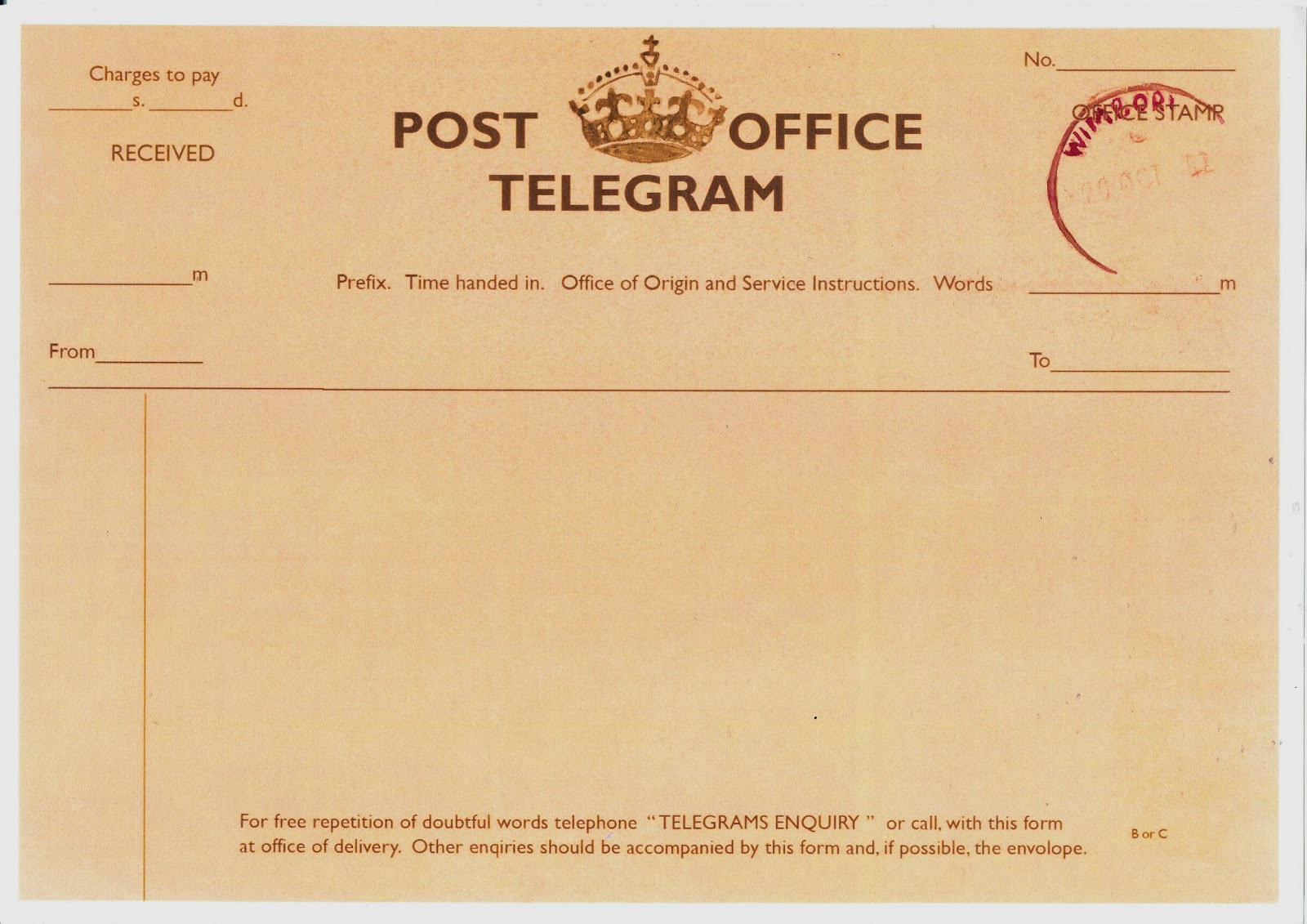
finding an image of a WW2 telegram, this became my initial piece of inspiration
and piece to work from.

Now that I had my initial image, I began the process of making my poster. I began by using the brusho inks in shades of brown and yellow, to create a piece of A4 paper that looked aged and worn. I made this by working in layers, starting with a watered down brown and then using the pure colours to add more layers.I created two of these pages with the ink, both using the inks in different way and applying the layers in different orders. The first of these pieces turned out much better than the second as it was much paler while still retaining the aged quality needed. The second piece way much darker and the brush marks could be seen, this was an effect that was not desired.


I then used Photoshop to make the chose piece of paper much paler, because when
I compared my aged paper with the paper than can be seen in original telegrams
I found that mine image was much darker. I used the hue/saturation setting and
changed the lightness and the saturation to make the paper look much lighter
and closer to the original image.

After some research I found that the font often used in the
WW2 era was Gills Sans, this made recreating the telegram much more achievable.
Setting the text to a very dark brown I began using my found telegram image to
create a base telegram that I will be using for my final piece. By using the
font and the colour of the background and the text, I managed to create an accurate
representation of a WW2 telegram. I left
a gap in the text of “POST OFFICE”, because I chose to hand render the crown
that can be seen as the logo for the post office.

Then after printing onto A4 cartridge paper, I used water
colours to paint in the crown in a dark brown. I also use the same hand
rendered technique to paint the stamp that can be seen on the right hand side
of the page. I chose to use a dark purple for this because in the found image a
bright purple was used.
After scanning the completed image and printing it once more
it turned the entire image paler, and I think that this gave it an older and
worn look, with I think works well for this piece of work.
No comments:
Post a Comment